Design with purpose, not just polish.
A bespoke design approach allows your website to be structured around how real customers think, browse and decide. Pages are built for specific purposes to maximise conversions.
Design works best when it’s grounded in how a website will actually be used, built and evolved. A bespoke approach ensures layouts aren’t just visually considered, but practical, scalable and ready to support long-term growth without compromise.
Why bespoke web design matters.
Designed for users, not themes
Bespoke design starts with user needs. Layouts, navigation and page structure are created from scratch to support clarity, usability and conversion — not constrained by a pre-defined theme.
Stronger UX, clearer UI
Templates often prioritise speed over experience. Bespoke UI design allows us to control hierarchy, spacing, interaction and flow so users can find what they need quickly and intuitively.
A better fit for your brand
Custom design ensures your website feels considered and distinctive. Visual language, typography and layout are aligned with your brand rather than inherited from a shared framework.
Built to scale and adapt
As your services evolve, bespoke websites adapt easily. New sections, functionality or journeys can be added without compromising structure or usability.
Elevating digital innovation to new heights
-


Premium Care Group -

WOW HYDRATE -
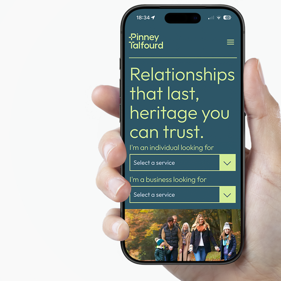
Pinney Talfourd -

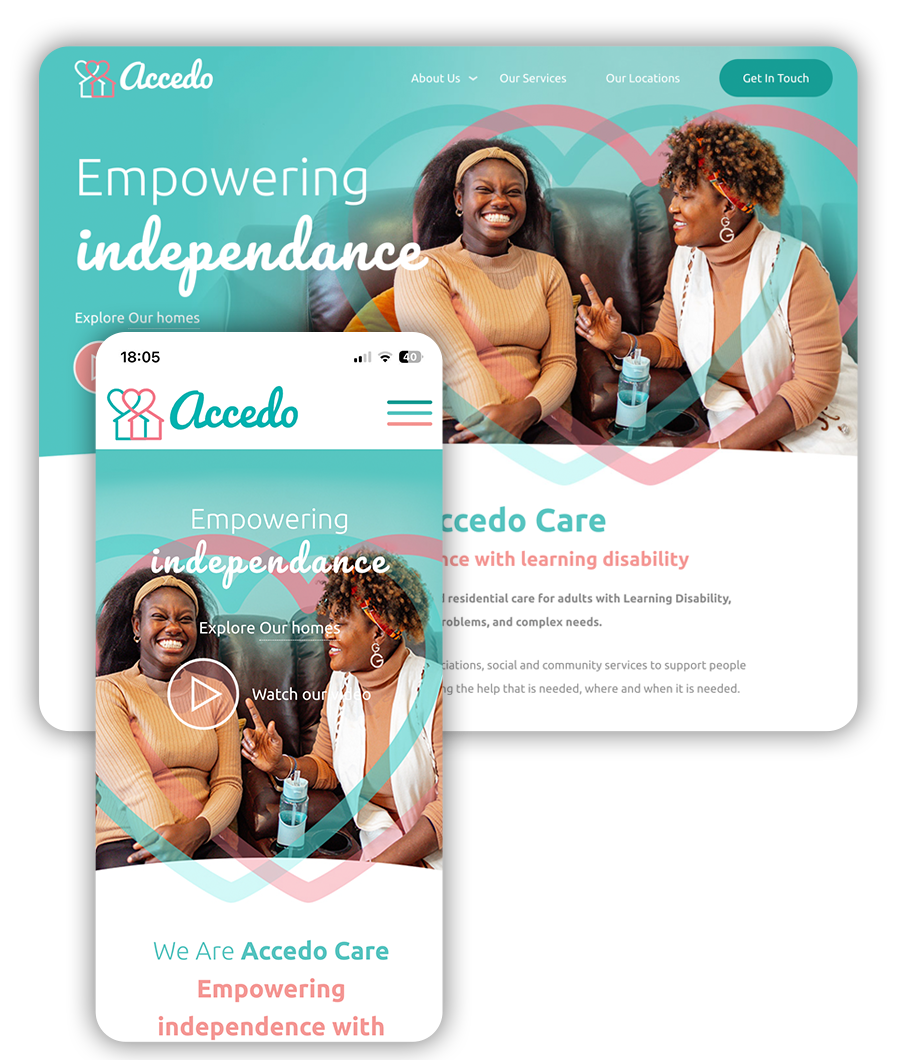
Accedo Care
Our approach to data-led web design.
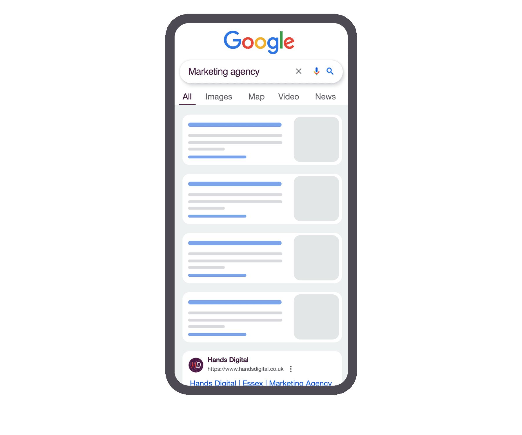
At Hands, design decisions aren’t based on opinion or personal preference alone. Every project starts with understanding how users interact, what drives engagement and where improvements can be made.
Before design begins, we review available analytics, engagement patterns and historical performance. These insights shape layout, navigation, content hierarchy and functionality to improve clarity and usability.
Frequently asked questions.
How does your web design process actually work?
Each project begins with a structured scoping session to understand your business goals, audience and current performance. We gather as much insight as possible at this stage so the initial design concepts closely align with your expectations from the outset.
How do you visualise the website before it’s built?
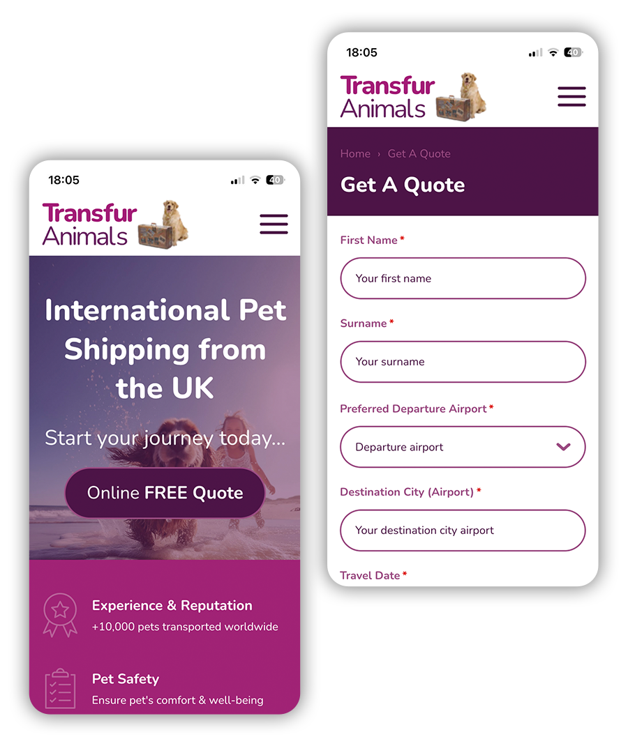
We design key page layouts first, typically including the homepage and one additional core page in both desktop and mobile views. These concepts are presented alongside clear explanations of functionality, usability and the purpose behind each design decision.
Will we see designs before anything is built?
Yes. All visual concepts are shared, reviewed and refined before development begins. No build work starts until the design stage has been fully signed off, allowing confident decisions without committing too early.
How do you use data to shape design decisions?
Where available, we review analytical data from your existing website, such as Google Analytics, during the scoping phase. This helps us understand user behaviour, customer journeys and enquiry paths so layouts, navigation and content placement are shaped around real user needs.
What if we don’t have much data yet?
If data is limited, we rely on proven usability principles, industry experience and insights from similar projects. As data becomes available over time, the design can evolve to better reflect real-world behaviour.
Will the design work across mobile, tablet and desktop?
Designs are created with responsiveness in mind from the outset, ensuring a consistent, usable experience across all devices.
How do you ensure the design supports business goals?
Every design decision is guided by what you want users to do. We treat websites as digital sales tools, focusing on clarity, conversion paths and user confidence rather than personal preference. Layouts, calls-to-action and content flow are all shaped around these outcomes and supported by data.
Continuing care after launch.
Hands Digital helps you create, maintain, optimise, and evolve your website post-launch...